
While spending an extended time with family in the U.S. I came across a pro bono project. An art teacher wanted to make infographic instructions for her class. Although I have access to graphic programs like Illustrator and InDesign, I was curious about “infograph helper programs”.
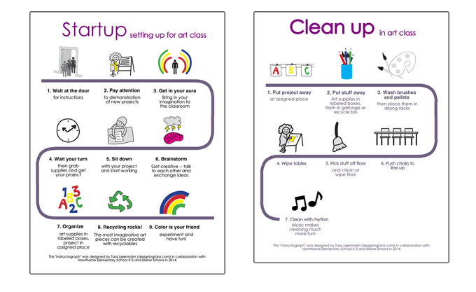
First I went to see the teacher and her fifth grade students to find out what kind of instructions should be included. We had a brainstorm together and the students drew pictures illustrating the different steps of setting up for class and cleaning up before leaving the classroom.
Then I took the drawings home and began vectorizing them (tracing and simplifying them). Although Illustrator is the go-to tool for illustrations, I find InDesign to be a simpler program to use for any illustrations that aren’t elaborate.
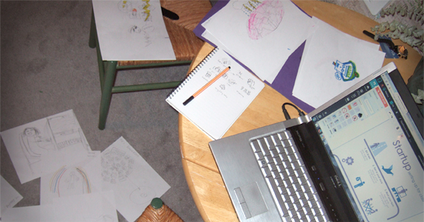
Design processes are reiterative; trying and failing and trying again, you often see what you lack when you start carrying out your idea. Using the words and phrases that came out of the brainstorming I arranged them with the icons to make coherent instructions. Then I had to go back and complement some of the instructions with simple illustrations of my own. After showing the design to the art teacher, corrections where made.
Vectorizations of the awesome fifth graders’ original icons.
![]()
Using piktochart.com to create the infographic
There are many tools for making an infographic. This blogger compares three different ones. I just picked one and gave it a go. I set up an account at piktochart.com, the “Easy-To-Use Infographic Creator” and used the free version.
Being accustomed to using graphic programs for my designs, I felt a bit inhibited. On the upside the interface is straight forward enough, and easy to use. There’s a pretty good variety of fonts, colors and graphics, with the possibility of uploading 20 images in the free version. There is a sufficient amount of free themes that cover the basics as far as infographic design goes. You can export your infographic to print-friendly formats, and big enough digital sizes (the pay version gives you more and higher resolution format options). So as far as easy-to-use I’d say: Yes, this is a good enough tool if you don’t have, or cannot use, graphic programs.
But there are some things that make the process more time consuming than it ought to be. When you have selected your theme and go to the editor, all the elements that were in the example are now in the editor. So to make your infographic you have to edit and replace each image and all the text. You can remove them all and start from scratch, but then you might as well not use that theme. And because you can’t have two fonts or text formatting in the same text box, you have to have multiple text boxes. This means keeping track of spacing and alignment. There are guidelines to help you snap the elements into the right positions, but making the guidelines align with the element you want it to can be tricky work. The spread you are working on is divided into parts of a maximum individual size, and there is no way to change the background for the entire spread.
I don’t know, maybe having worked in graphic programs I am tainted by the amount of possibilities, but would I do it again, I would just open Illustrator. Being able to see both designs side by side, align them and make sure all fonts, dimensions and colors match exactly is a clear advantage. It was still an interesting process, to try a different kind of tool for executing my design.