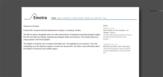
Emotra AB wanted a professional and clean website, and a logo to go with it, for their medical technology development company. The curve of the logo illustrates the orientation reaction in the brain, which purpose is for our bodies to prepare for action. This is part of the research Emotra AB does. The signal is reiterated in the footer of the website.
The screenshot below shows the original design that I worked on. Since then, the company has expanded and therefore updated its profile. To visit the website, click here or on the image.

